Office Lighting Design
1. The significance of lighting to the office
For most office workers, most of the time of the day is spent in the office. In this place where dreams set sail, employees are conscientious and conscientious to complete various tasks, but they are often unexpectedly Tired down! Whenever drowsiness strikes, I drank cup after cup of coffee, but the feeling of tiredness is still there. I often can’t keep up with work, and my eyes are tired and dry. Many people are annoyed. Why are you sleepy when you get to the office?
Have you ever thought that the “culprit” that caused these problems is likely to be: lights!
Appropriate lighting can improve employee efficiency Appropriate and reasonable lighting is one of the keys to improving employee office comfort and efficiency. Many people think that office lighting is the simplest lighting design. Usually, they don’t pay attention to those atmosphere renderings. They think that as long as they can illuminate the space, it is not the case. Statistics show that more than 70% of people work in the office for more than 6 hours a day. Good office lighting can not only make the office more beautiful, but also directly affect the work efficiency of employees. Adequate lighting can make employees feel more comfortable, while reducing error rates and reducing eye fatigue, so lighting is particularly important. Moreover, the intensity, color temperature, and angle of the light will greatly affect the visual experience of employees, and even eye health. This is why many traditional offices always give people a cold and stereotyped impression, while some offices give people a warm and active atmosphere. Most of these are caused by lighting problems. When the first impression score is scored, it accounts for a large proportion.
Office lighting has a guiding role:
(1) Lights can virtually divide the space. For example, the office area uses bright and cold light, and the leisure area or the pantry will use warmer light. The two areas are visually different, and employees can easily find different areas.
(2) The shape of the light can guide the direction of the flow of people. For example, the light is embedded in the ground or wall, and it is made into a strip shape to give instructions to people; or the light is quoted in the place with steps, which not only reminds employees to pay attention to the safety of the stairs, but also makes the stairs more three-dimensional. It looks very stylish.
(3) The light can focus the line of sight. Through the size, shape, color, etc. of the light, the contrast with the surrounding area is formed. If there is a difference, there is attention. Combined with the wall sticker slogan that needs to be highlighted, it will attract more attention.

2. Office lighting design
Why buy a lamp with a large wattage for the office, but it is still not bright enough? When most people buy lamps, they will naturally judge the brightness of lamps by “wattage”, thinking that the higher the wattage, the brighter the lamps. But now in the LED era, with the same brightness, incandescent lamps may consume 85W of power, while LEDs only need 12W, so judging the brightness of lamps by wattage does not fully meet the requirements. Now it is more important to look at the “luminous flux” ” and “Illuminance”. Next, let’s briefly explain how to understand the “language of light”. The luminous flux is like the attack power, the illuminance is like the opponent’s damage, and the beam angle is the attack range.
2.1. How to choose the right lights
How to choose different lighting for the work area and leisure area in the office space? First we have to consider two aspects:
(1) Color temperature
To put it simply, the lower the color temperature, the warmer the color, and the more reddish it is. The working area is suitable for white light with a color temperature of about 5000K, and the leisure area is suitable for yellow light with a color temperature of about 3000K.
The color rendering of white light is more realistic, the contrast of illumination is large, it tends to sunlight, and the color temperature is colder, so it is suitable for lighting use of work nature. The ambient light source is brighter and clearer, which can boost the spirit. It is suitable for the shaping of interpersonal relationships and atmosphere.
(2) Illumination
Illuminance refers to the amount of luminous flux of visible light received per unit area of the illuminated surface. The unit is lux, 1ux=1 lumen/㎡. We often say that the working desktop is bright enough, which usually refers to whether the illuminance is enough. In the case of the same area, the higher the luminous flux of the light source, that is, the higher the lumen value, the higher the illuminance. Generally speaking, if the lighting environment is required to be bright and clear, the requirements for illuminance are also higher. The state stipulates that the illumination in the office area should not be lower than 300lux at least. The general space illumination brightness is not less than 100lux, and the local illumination brightness is not less than 600lux.

Knowing the two important requirements of color temperature and illuminance, we can start to choose lamps:
- Strip lamps
Most of the office desks in companies have a rectangular design. In this case, strip lamps (flat, panel lamps, linear lamps) are most suitable. And this kind of light has high brightness and is not too dazzling, and the irradiation area is uniform.
- Circular lamps
Most of the circular lamps are used in the leisure area. The brightness of the lighting here is not so important. The main reason is that the lighting is soft, which can make people feel relaxed. Moreover, the round shape can also soften the space atmosphere compared with the angular office furniture.
- Modeling lamps
Electric lamps and modeling lamps can be selected in the tea area or coffee area. Lamps with different shapes can set off a leisure and relaxing atmosphere.
2.2. How to design lighting for different areas
For different areas, illuminance and lamp shape have different requirements:
(1) Front desk
The front desk of each company is responsible for the company’s facade, and this is the area where the corporate image is displayed. Therefore, in addition to providing a certain amount of illuminance in the design of lighting fixtures, it is also required to diversify the lighting shape, increase the sense of design, and make the lighting design consistent with the corporate image.
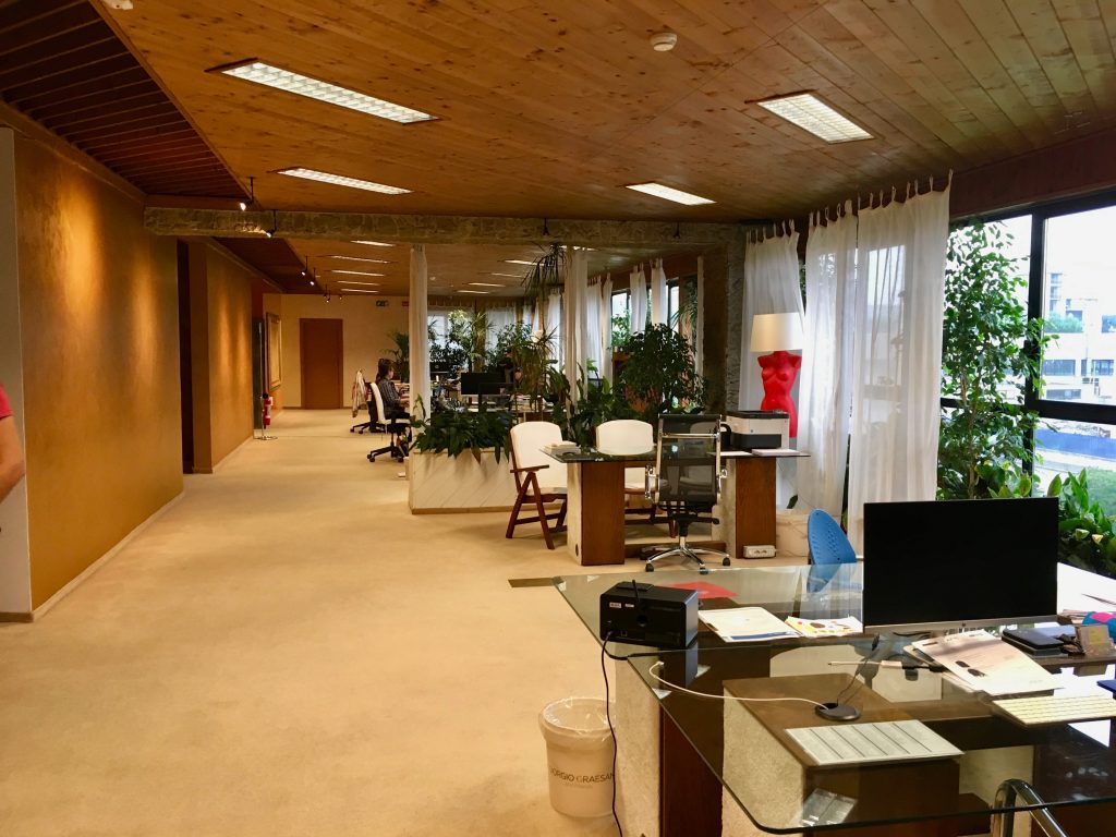
(2) Open office area
The open office area, as the area with the largest proportion of the current office space, cannot be set in a location without natural lighting. In the lighting, uniformity and comfort should be combined as the design principles. Usually, the method of arranging lamps with uniform spacing is adopted, and the corresponding lamps and lanterns are used in combination with the functional area of the ground. Workbench areas often feature strip light fixtures (slabs, panels, line lights) to evenly light the workspace and reduce glare.
If the above two areas are opposite sitting stations, one lamp should be set for every two opposite sitting stations, and if it is a single row station, one lamp should be set for each station. The lamps and lanterns are set parallel to the station, at the center line of the station, and the height of the light-emitting surface is 2.4 meters.
(3) Personal office:
A personal office is a small space, so ceiling lighting fixture brightness is not that important. Personal offices should try to use natural light, because natural light is the most suitable light source for human eyes, and working under natural light is the most comfortable.
(4) Conference room:
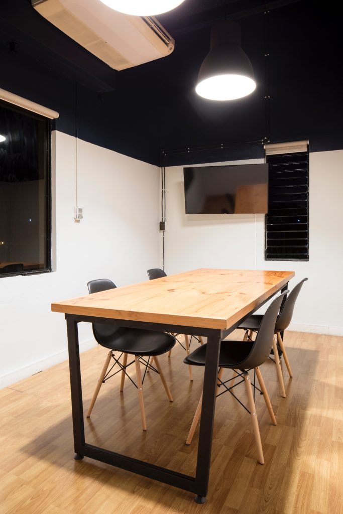
Conference room lighting should consider the lighting above the conference table as the main lighting. To make people feel focused, the illumination should be appropriate, and auxiliary lighting can be added around.

(5) Leisure area:
The leisure area is mainly comfortable and not dazzling. It is recommended that the lighting should not be too strong, which can make people relax. Generally, modeling lights can be used in the leisure area to enhance the atmosphere.

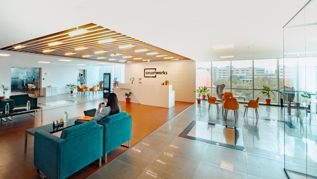
(6) Reception area:
The reception room can function as a “business card”. So first impressions are very important, and lighting can help these offices achieve the desired effect. The light atmosphere is mainly soothing, and some of the places where the products are displayed need to use light for accent lighting.
(7) Public channel:
For the lamps in the public passage area, the illumination can be flexibly controlled according to the aisle, that is, the multi-circuit method, which is convenient for the purpose of overtime and energy saving at night. Generally, the illumination is controlled at about 200Lx. The selection of lamps and lanterns is mostly downlights, or the combination of hidden light strips can also serve the purpose of guidance.
3. Concluding
Finally, to make a small summary, a good office lighting should meet the following points:
(1) The lighting should be healthy and comfortable, just like natural light, bright but not dazzling, gentle but not hot.
(2) Appropriate illumination can make employees feel comfortable.
(3) The installation position of lamps and lanterns should be scientific and reasonable to avoid direct or indirect glare that affects people.
(4) Understand the lighting needs of different areas and make a reasonable match.
(5) The lighting of the partition should be cautious, so that the room has a reasonable brightness distribution, so that employees can combine work and rest.
Hope this article is helpful to you, and for more information, please contact us at www.tachyonlight.com!

